Making Your Shop Easy to Browse

Great navigating feels intuitive.
When customers move through your shop effortlessly, they aren’t thinking about menus, labels, or structure. They’re following their curiosity. They’re noticing products that catch their eye. They’re imagining how something might fit into their life.
For small ecommerce businesses, the way customers navigate your shop plays a quiet but critical role in trust, confidence, and conversion. Customers stay longer when moving through your site feels natural. If it feels confusing or challenging? They leave, no matter how beautiful your products are.
The goal isn’t to impress customers with clever structure. The goal is to make moving through your shop feel easy.
Why Navigating Small Shop Websites Can Feel Hard
Most friction in navigating a shop doesn’t come from bad intentions. It comes from growth.
As a shop evolves:
New collections are added
Seasonal items rotate in and out
Special releases and promotions appear
Categories expand to accommodate more products

Rockport does a nice job of highlighting not only seasonal items, but also offers Valentines day Gift Ideas in the top menu
Each change makes sense on its own. Over time, though, the experience of moving through the site can start to feel heavier. Customers may need to pause and think instead of flowing naturally from one area to the next.
The problem isn’t growth itself. It’s growth without a clear direction.
When navigation feels clear, customers can quickly understand:
What kind of shop is this
How products relate to one another
Where it makes sense to go next
When those signals are missing, customers start guessing, and guessing creates friction.
Navigating Should Feel Guided, Not Demanding
When navigating a shop is difficult, customers work harder than they should:
They scan labels, trying to decode the meaning
They backtrack after clicking the “wrong” thing
They hesitate before choosing where to go next
This mental effort is subtle, but it matters. The more work, the more likely customers are to get frustrated and leave. Good navigation removes unnecessary decisions. It allows customers to move forward with confidence, not caution.
How to Make Moving Through Your Shop Feel Simpler
Making navigating easier doesn’t mean stripping your shop down. It means shaping the experience around how customers naturally move and decide.
1. Help Customers Move With Familiar Language
Customers navigate using their own words, not yours.
They think in terms of:
Product types
Uses or needs
Price ranges
Occasions
When labels reflect internal naming or marketing concepts, customers have to translate. When language feels familiar, moving through the shop feels effortless.
For example:
“New Arrivals” is easier to move toward than “Drop 08”
“Gifts” is clearer than “Curated Selections.”
“Everyday Essentials” feels more approachable than a collection name only your team knows
When navigating mirrors customer language, customers don’t stop to interpret; they keep going.
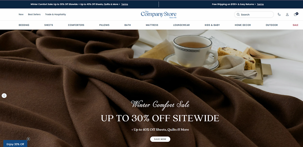
The Company Store uses natural language on its menu. This helps customers make quick decisions based on their needs.
2. Reduce Decision Points at the Start
The first few choices a customer encounters set the tone for the entire experience.
Too many options too early can make navigating feel overwhelming. Fewer, clearer starting points help customers settle in quickly.
A strong first layer of choices helps customers answer:
Where should I begin?
What’s most important here?
From there, more detail can unfold as customers move forward, keeping the experience clear and easy to follow.
3. Keep the Experience Predictable as Customers Move
As customers navigate from page to page, they rely on patterns.
When something works one way in one place, they expect it to work the same way everywhere else. When patterns shift unexpectedly, navigating becomes effortful.
Consistency helps customers:
Trust where a click will lead
Move faster without second-guessing
Stay oriented as they explore
Predictable experiences aren’t boring. They respect the customer’s attention.
4. Guide Attention Toward What Matters Most
Navigating isn’t just about access; it’s about emphasis.
When everything is treated as equally important, customers aren’t sure what to focus on.
Highlighting key areas helps them move with intention.
This might include:
Most-loved products
Core collections
Entry points for new customers
Seasonal or timely offerings
For example:
A skincare shop might guide customers toward starter routines
A clothing boutique might surface everyday staples
A gift shop might make it easy to find popular price ranges
This kind of guidance doesn’t feel pushy. It’s helpful.
When Moving Through Your Shop Starts to Feel Crowded
If navigating your shop feels cluttered, you’re not alone. This is a common stage of growth.
Instead of adding more places to go, look for ways to simplify movement:
Combine areas that feel similar
Remove paths that rarely get used
Offer ways to narrow options once customers are already exploring
For example, instead of sending customers down multiple parallel paths, let them choose one clear direction first, then refine as they go.
This keeps movement flexible without overwhelming.
Findability Is Part of Navigating Well
Good navigation supports both browsing and searching.
Customers should be able to:
Explore casually without getting lost
Quickly locate something specific
Understand where they are within the shop
Clear naming, logical groupings, and consistent structure all contribute to this sense of orientation.
When customers can find their way easily, they feel more confident continuing—and more willing to explore.
How Navigating Shapes the Brand Experience
The way customers move through your shop sends a message.
When navigating feels clear and thoughtful, your brand feels:
Considered
Trustworthy
Customer-focused
When it feels confusing or inconsistent, customers may assume the same about the business behind it.
The best navigation doesn’t call attention to itself. It quietly supports the experience from start to finish.
Final Thought: Obvious Means Supportive
If navigating your shop feels obvious, that’s a success.
“Obvious” means:
Customers don’t pause to figure things out
Moving forward feels natural
Browsing feels calm and enjoyable
When navigation is easy, customers spend less energy finding their way and more energy connecting with your products.
The goal isn’t to impress. It’s to support.
Want support improving your navigation? Let’s talk. We can quickly identify ways to improve your website and set you up for long-term success.


Comments